Apple Music Classical — UX Case Study (2023)
Identifying differences between Apple Music and Apple Music Classical.
Behance Link ↗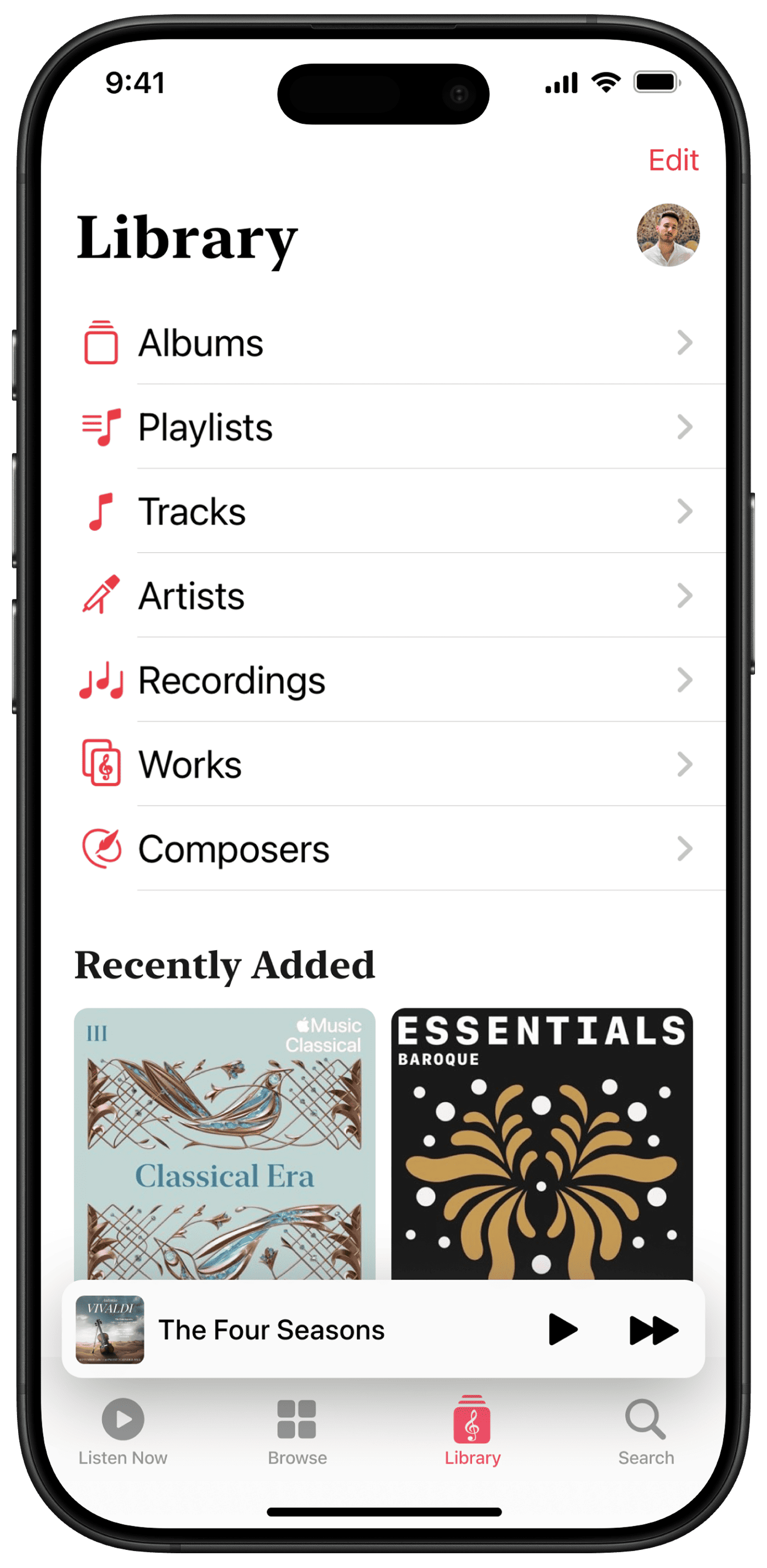
In 2023, Apple released Apple Music Classical as a standalone app focused on classical music.
The work looks at four main areas of the app: Search, Listen Now, Browse and Library; and proposes UX and UI refinements to improve alignment with Apple Music while still respecting the specifics of classical metadata and listening habits.
Why classical needs a different lens.
Classical music is difficult to categorize. It spans centuries, styles, ensembles and recording histories, and a single work can exist in many versions with different performers, conductors and languages. Traditional tags such as artist, album and song title are not enough.
Apple Music Classical was created to make this world easier to search and browse, but it inevitably diverges from Apple Music in structure and behavior. This case study examines those differences and asks how far the two apps should converge to support both beginners and experts.
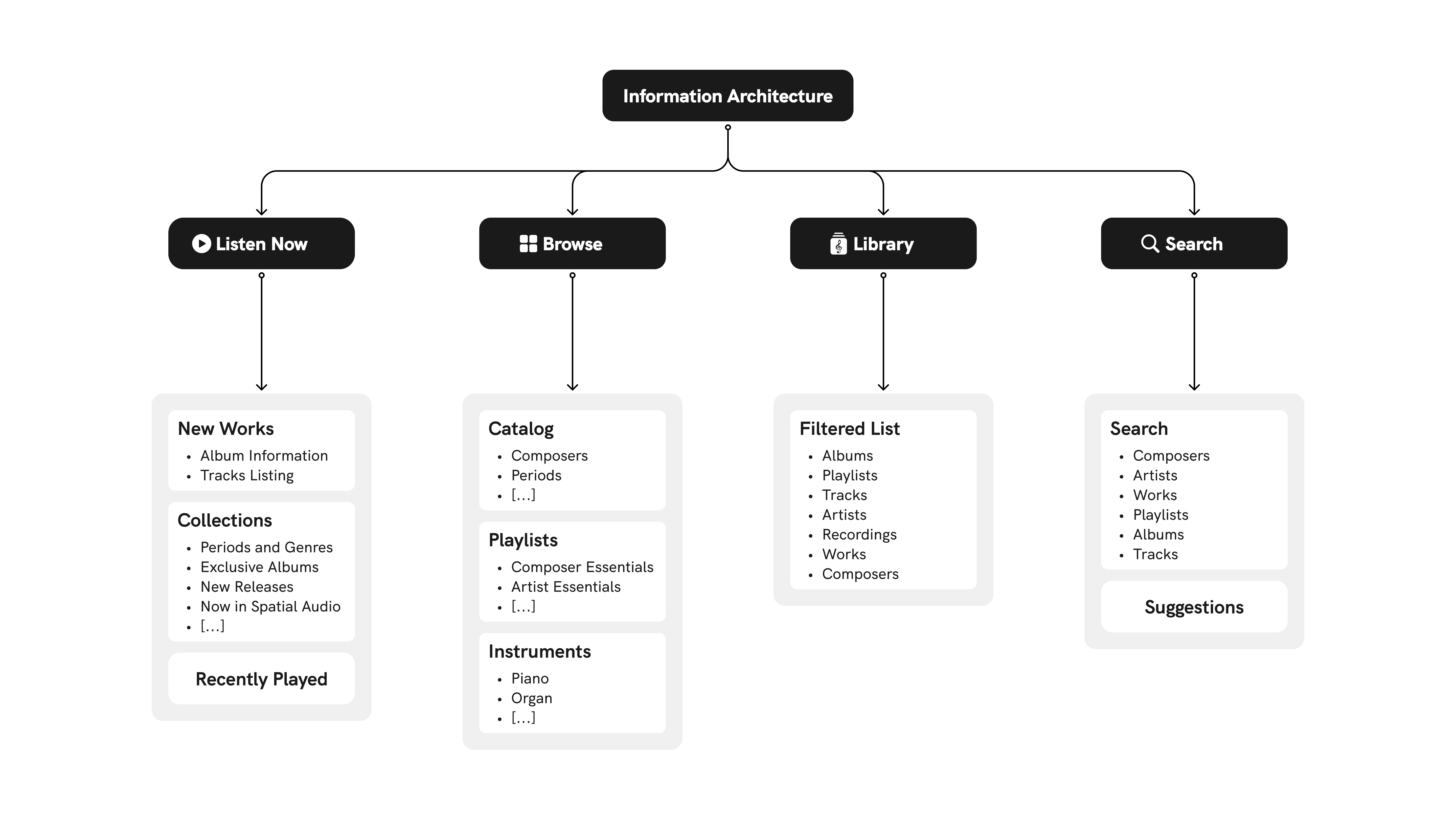
Apple Music Classical — Current information architecture.
Search
Searching for classical music is not as straightforward as finding a Dua Lipa song. Traditional music metadata usually focuses on artist, genre, song title or album title. Classical music metadata adds many more dimensions, including composers, conductors, orchestras and choirs.
Because there is no standard classification system for classical music, users often struggle to find specific pieces or recordings. A single work can have many versions by different performers and in different languages. For example, Giacomo Puccini’s opera La Bohème has been recorded and performed countless times, making it hard to pinpoint a specific interpretation.
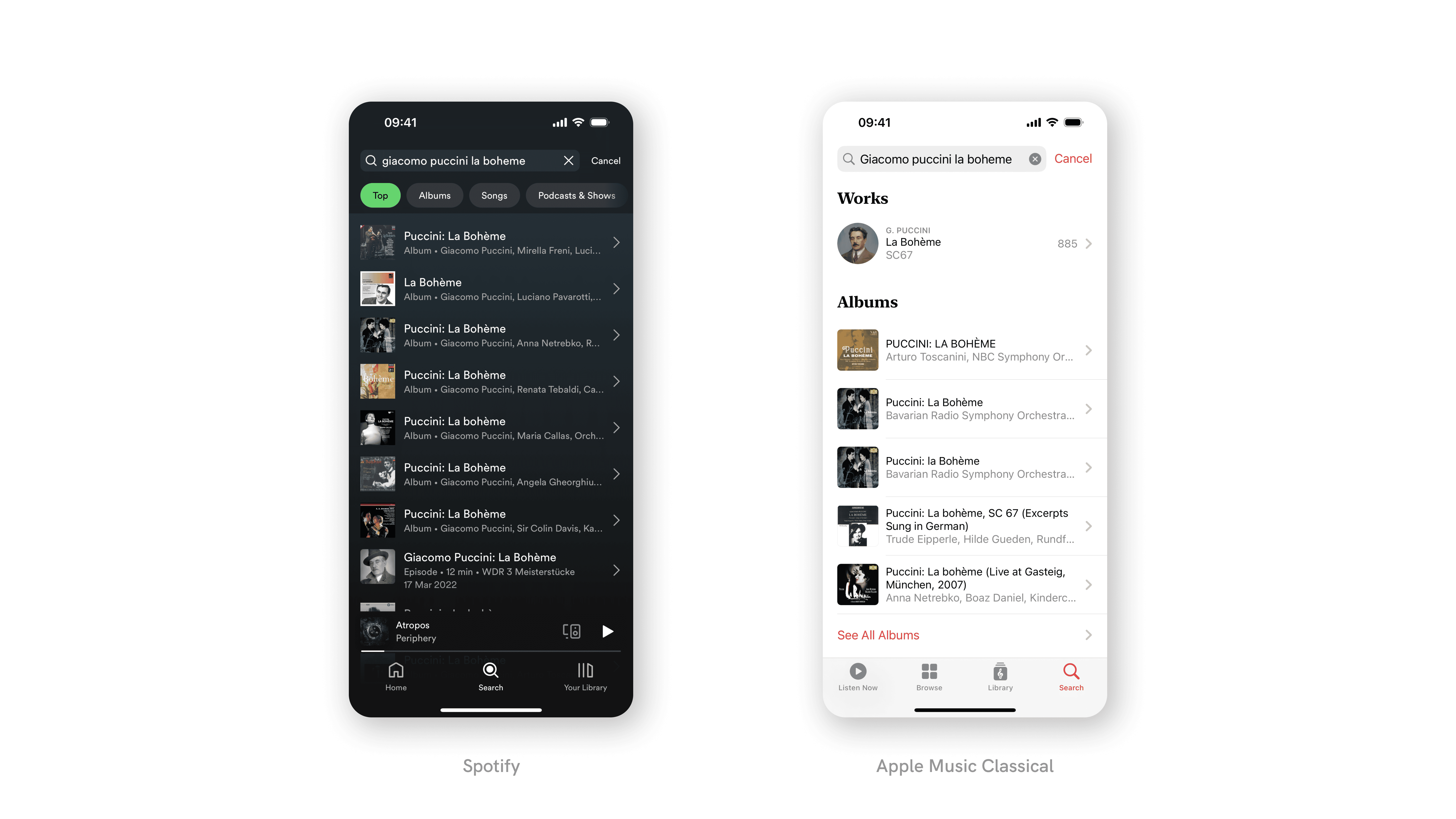
La Bohème by Giacomo Puccini searched on Spotify and Apple Music Classical.
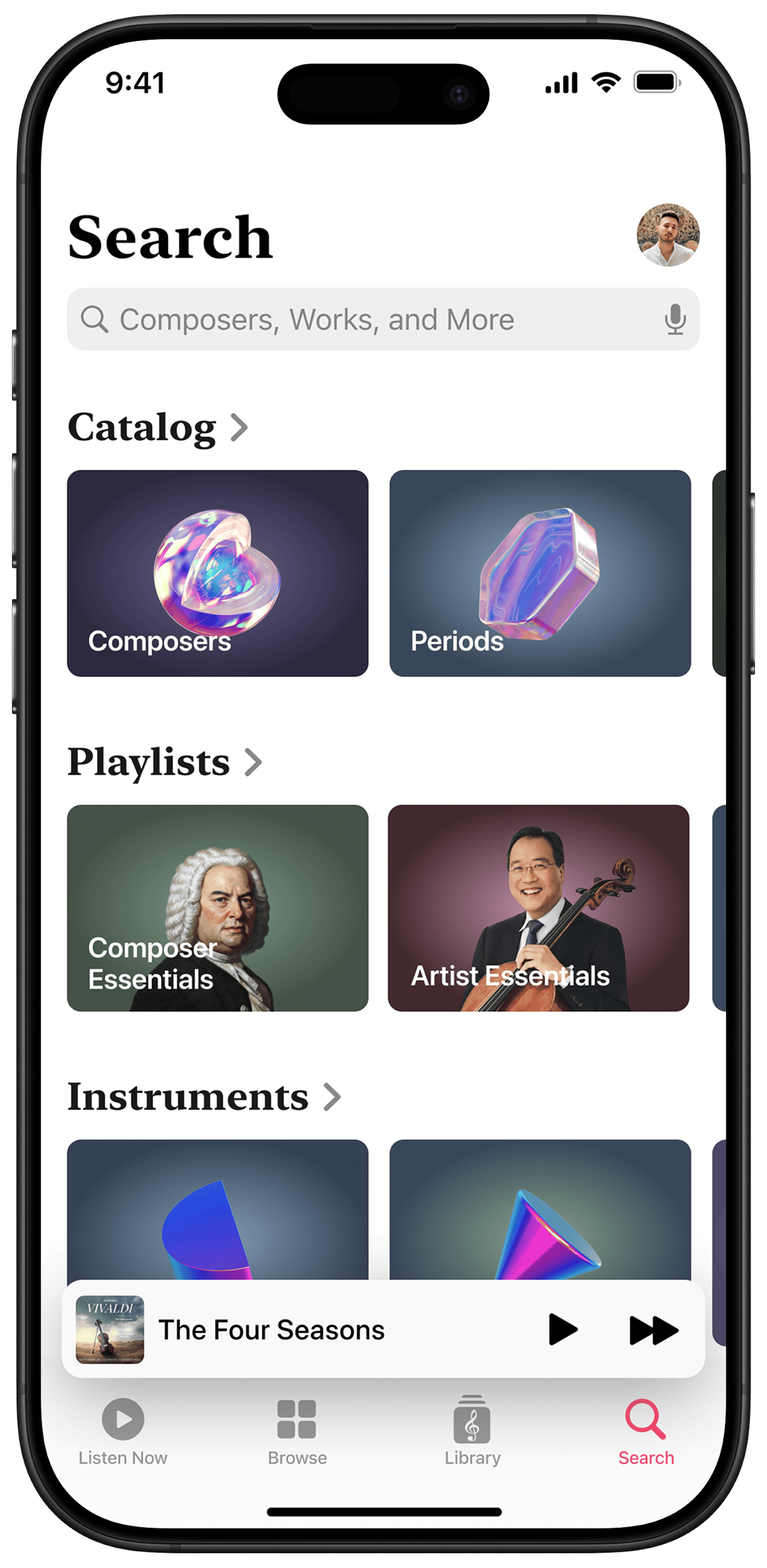
The Search tab in Apple Music Classical differs from the one in Apple Music. It offers a list of textual suggestions without categories or recommended playlists, which are currently placed in the Browse section. Integrating catalog listings, editor‑picked playlists and categories directly into Search would help users find what they need more easily, regardless of their level of expertise, and make exploration more natural.
In the concept, the segmented control is replaced by collections with a “Show All” chevron, allowing users to reveal full lists without switching views.
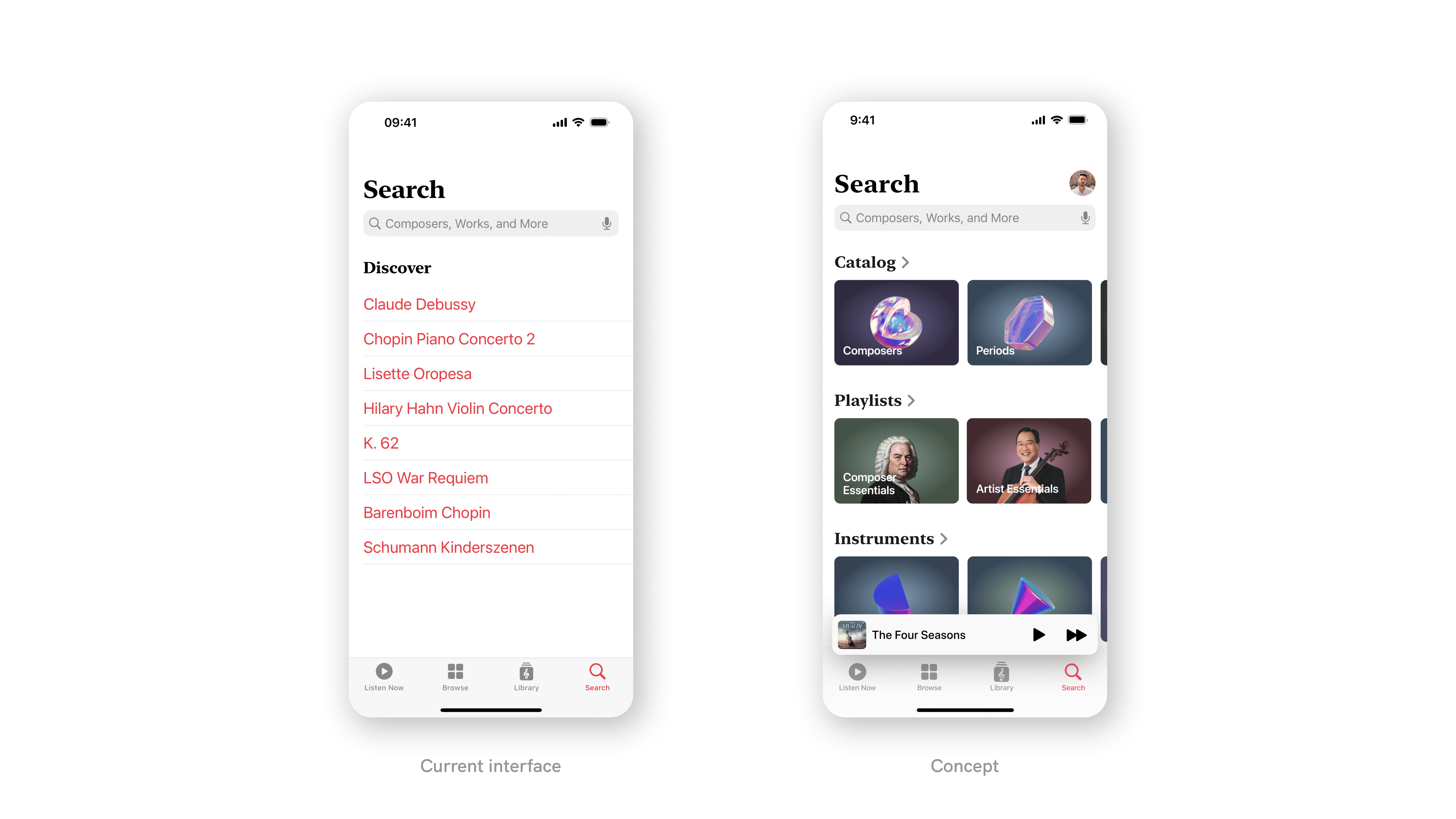
The current Search interface and the proposed concept.
Listen Now
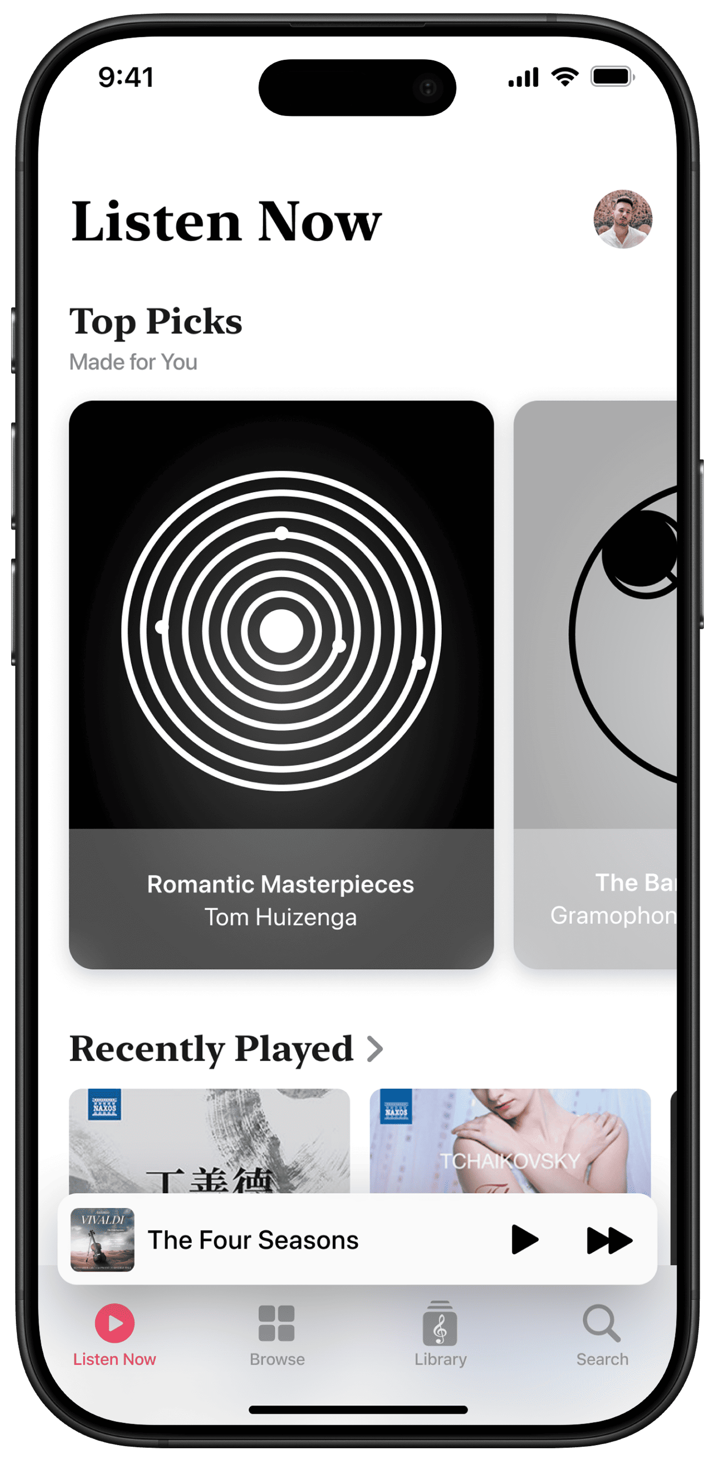
In Apple Music, the Listen Now tab provides a personalized selection of songs and playlists based on listening history and preferences. Apple Music Classical, instead, shows currently popular and new releases, without individual recommendations. This behavior overlaps with what the Browse tab is expected to do.
Integrating personalized recommendations based on the user’s interests would redefine the classical experience. A redesigned Listen Now for Apple Music Classical suggests relevant playlists, works, recordings, genres and what friends are listening to, similar to Apple Music’s Listen Now tab. This turns it into a true, personal entry point into the classical catalog.
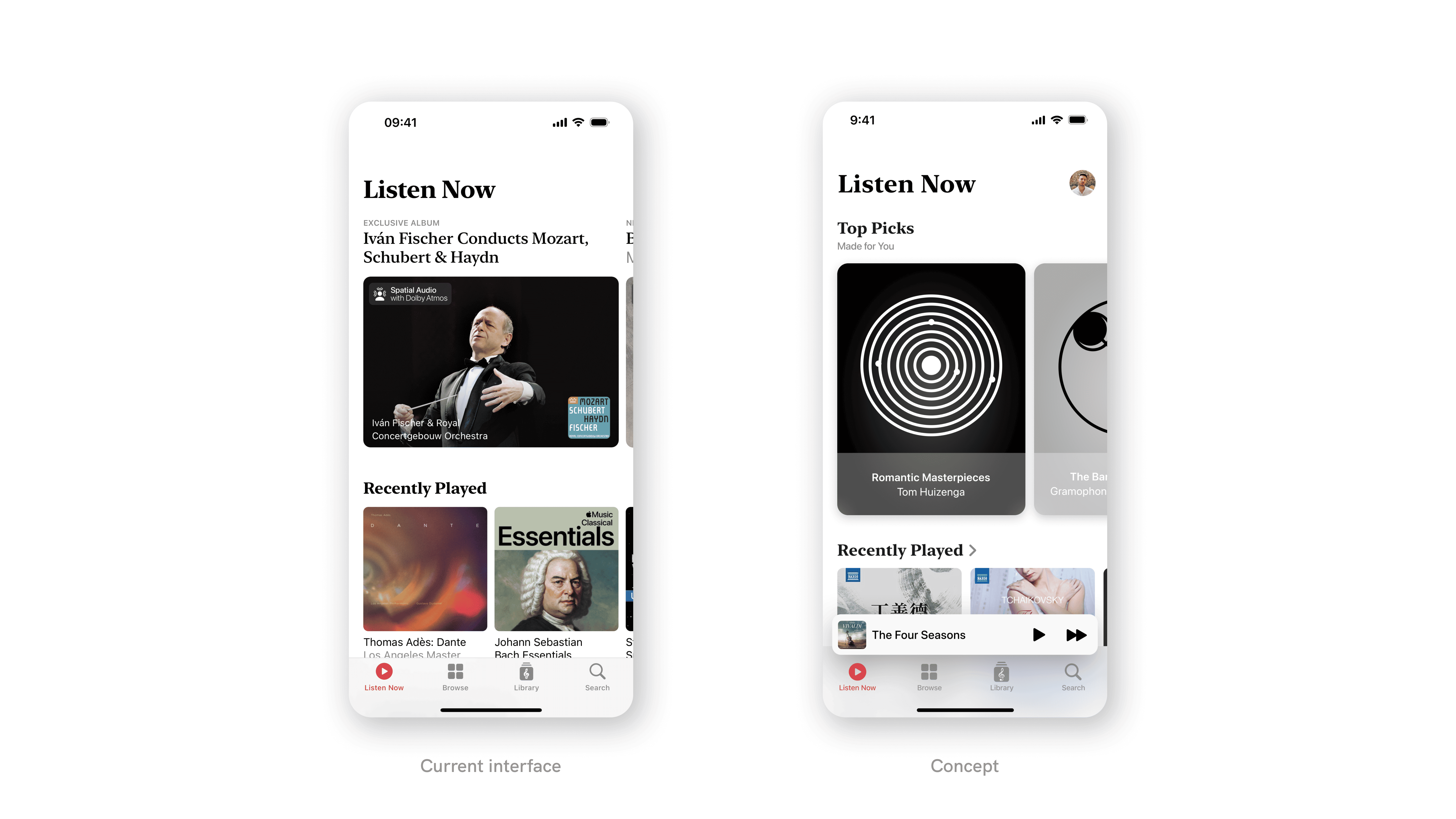
The current Listen Now interface and the proposed concept.
Browse
In Apple Music Classical, the Browse tab uses a segmented control to switch between Catalog, Playlists and Instruments, which creates a different experience compared to Browse in Apple Music.
The proposed Browse integrates selected playlists, popular recordings and new releases, currently found in Listen Now, into a single view. Users can discover expert‑curated collections organized by factors such as mood, activity and genre, while still accessing classical‑specific dimensions like instruments.
In this way, the Browse tab in Apple Music Classical offers a more familiar, Apple Music‑like structure, while still highlighting what makes classical content unique.
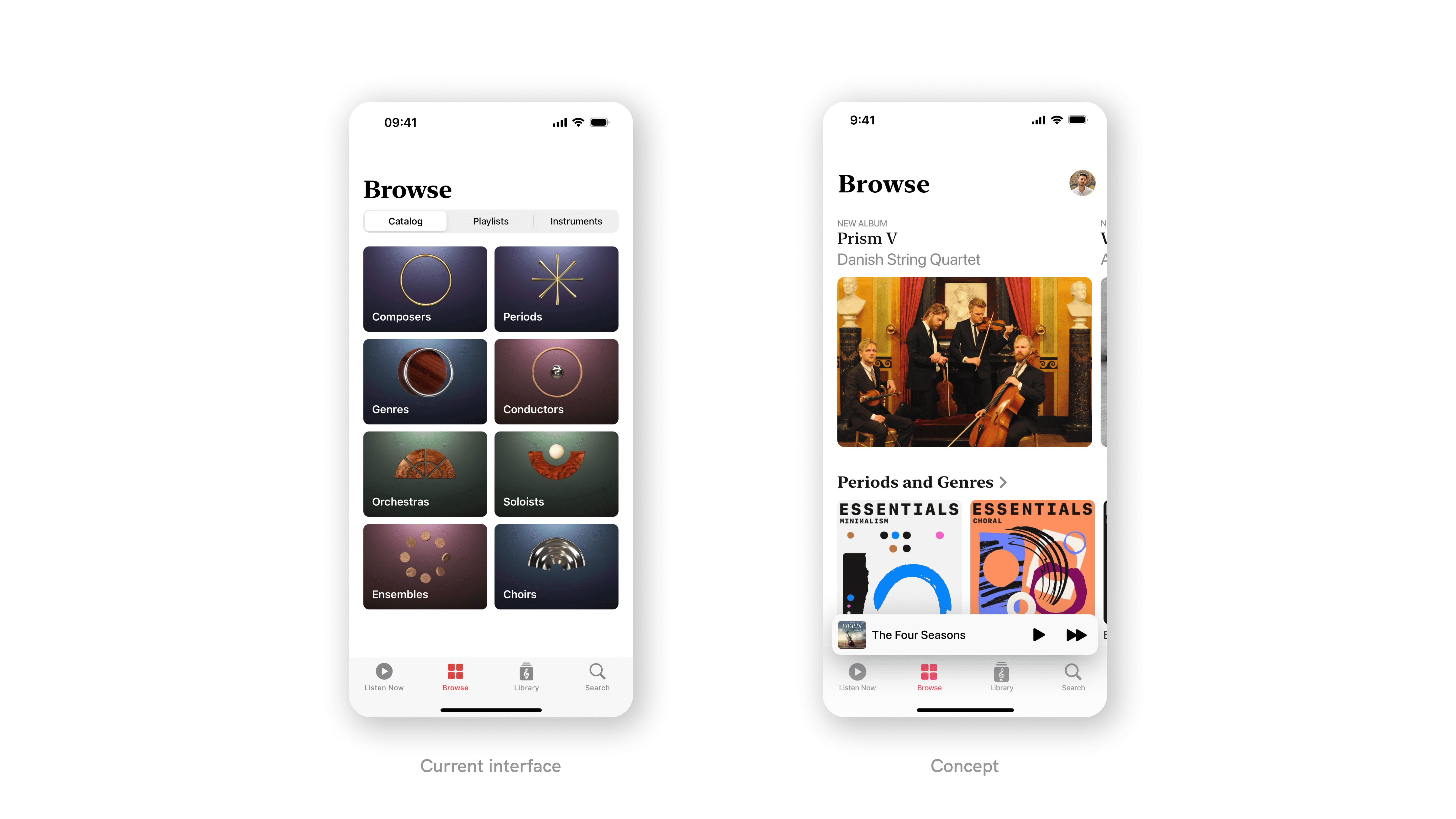
The current Browse interface and the proposed concept.
Library
The Library tab in Apple Music Classical presents a list of filters but does not include the Recently Added section available in Apple Music. However, items added in Apple Music Classical do appear in the Recently Added section of the Apple Music library, which can create confusion. It is unclear whether this omission is intentional.
In the concept, an Edit button in the navigation bar lets users choose which lists to display or hide, such as albums or playlists. Combined with a Recently Added section, these organizational enhancements give listeners more control over albums, playlists, composers and works, and bring the Library tab closer to the Apple Music experience.
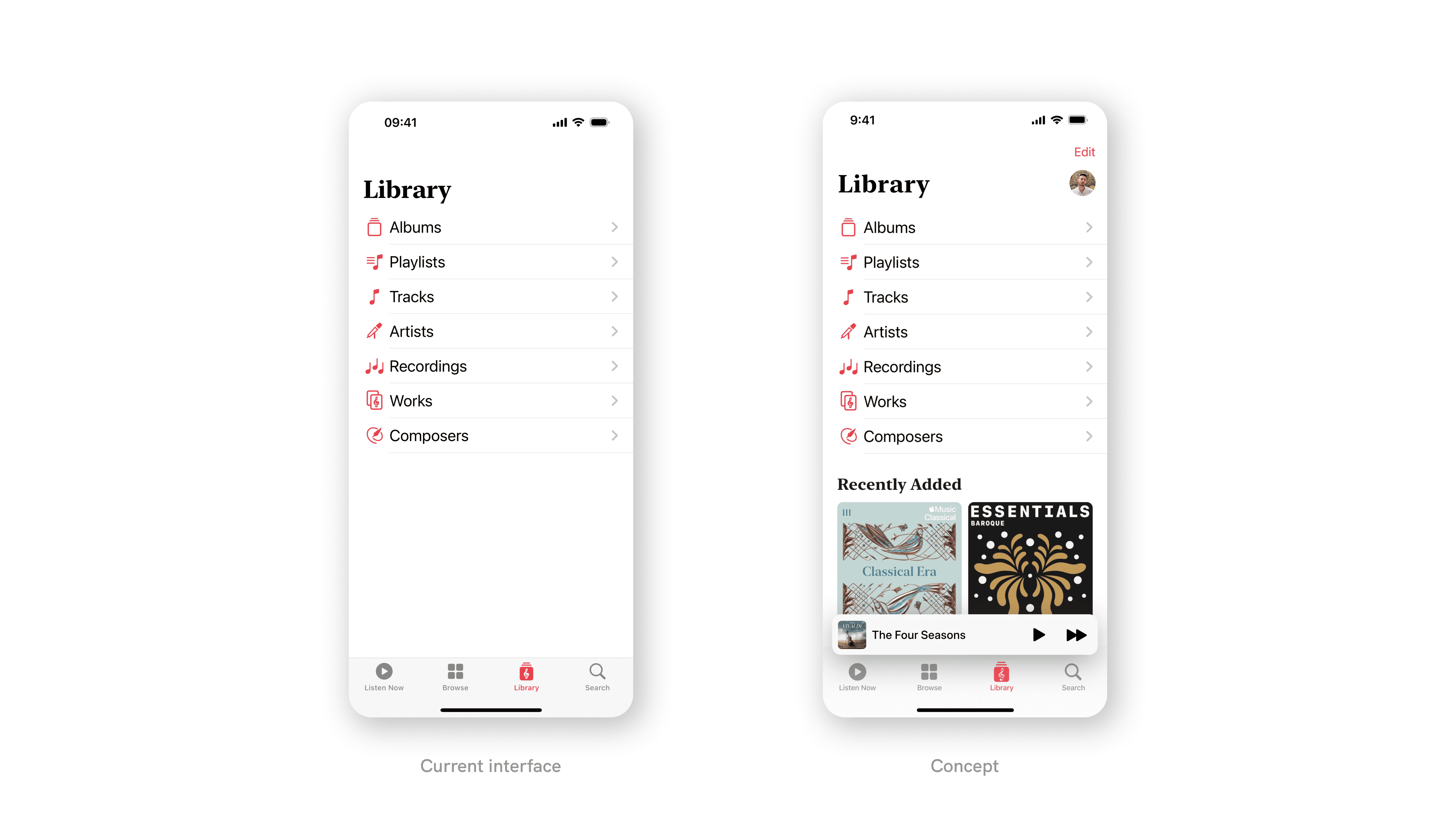
The current Library interface and the proposed concept.
Conclusion
The analysis of Apple Music Classical shows that differences in information architecture and content presentation have a direct impact on how comfortable users feel moving between it and Apple Music.
Enhancing Search with integrated categories and playlists, bringing personalization to Listen Now, restructuring Browse for familiarity, and aligning Library with Recently Added and editable filters all point to a more coherent experience—one where Apple Music Classical feels distinct yet clearly part of the same ecosystem.